
The Magic of Color: A Playful Guide to Color Theory for Artists
When I was younger, my mom owned a candy store. Our house had a storefront, and when you walked through the front door of the shop, you’d see another door straight ahead—the one that led to our living room. We lived candy. Every week revolved around whatever holiday orders needed to be made.
My memories are full of handmade display cases stacked with chocolates, laughter echoing through the kitchen as we dipped strawberries late into the night for Valentine’s Day, and the smug satisfaction of showing my sisters that I had made the perfect turtles. (It’s all about the pecan-to-caramel-to-chocolate ratio, if you know, you know.) It was a sweet, color-filled childhood.
Only recently did I start to wonder: did growing up surrounded by candy—those glossy reds, soft pastels, deep browns and gold foils—shape how I see and understand color?
Imagine walking into a candy store, eyes wide, heart racing. Shelves overflow with vibrant sweets—ruby-red licorice, golden caramel, rainbow-colored taffy. Now, imagine that same store in grayscale. The thrill fades. That, dear artists, is the power of color.
Color isn’t just decoration—it’s emotion, atmosphere, storytelling. Understanding how colors work together (or clash spectacularly) is essential for any artist. So, let’s dive into the magic of color theory with a bit of whimsy, shall we?

Old photo of my mom in that same candy store with my daughters around 2007. Sorry about the glare!
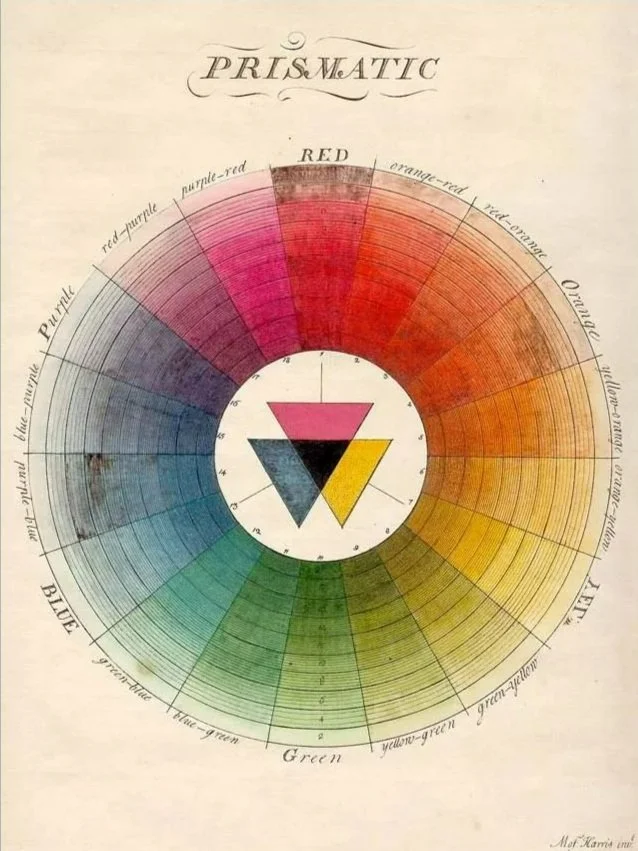
Moses Harris’s The Natural System of Colors. Image courtesy of Wikimedia Commons.
The Color Wheel: Your Artistic Compass
Think of the color wheel as your map to the world of hues. It’s divided into three main groups:
Primary Colors: Red, yellow, and blue—these are the trailblazers. They mix to create all other colors but can’t be made by mixing other hues.
Secondary Colors: Green, orange, and purple—born from the unions of primary colors.
Tertiary Colors: The in-betweeners like blue-green, red-orange—those sophisticated hybrids of primary and secondary hues.
The Magic of Color Harmonies
Colors love relationships. Some are best friends; others are dramatic rivals. Here’s how they interact:
Complementary Colors: These opposites (like blue and orange) create bold, high-contrast effects. Think of a sunset against a twilight sky—vivid and striking.
Analogous Colors: Neighbors on the color wheel (like yellow, yellow-orange, and orange) that blend harmoniously, perfect for serene and cohesive compositions.
Triadic Colors: Three colors evenly spaced on the wheel (like red, blue, and yellow) bring dynamic energy while maintaining balance.
Warm vs. Cool: The Mood Makers
Warm colors (reds, oranges, yellows) are the life of the party—energetic, inviting, loud. Cool colors (blues, greens, purples) are the introverts—calm, soothing, mysterious. Use warm colors to command attention and cool colors to create depth and tranquility.
The Power of Value and Saturation

Candy Counter by Wayne Thiebaud | 1962
Color isn’t just about hue; it’s about value (lightness or darkness) and saturation (intensity). A deep, rich red feels different from a soft pastel pink. Mastering these elements allows you to guide the viewer’s eye, create mood, and enhance storytelling in your art.
Breaking the Rules (Because You Can)
Once you understand color theory, feel free to break it. Van Gogh’s swirling blue and yellow night skies? Genius. Picasso’s blue period? Emotional storytelling at its finest. Experiment, explore, and don’t be afraid to let your colors clash and converse in unexpected ways.
A Final Thought
Color is a language—a mood-setter, a storyteller, an artist’s secret weapon. So play with it. Let it surprise you. Let it sing. And the next time you walk into a candy store, take a moment to really look. Notice the glossy reds, the fizzy blues, the soft pinks and golds—all humming together like a little symphony before you even take a bite.
As for me, I just have to close my eyes and I’m back there: behind the counter, chocolate on my fingers, the air thick with sugar and color.
Now go—paint with abandon, and maybe a little sweetness too.

This is a stock photo but it reminds me of the bright red boxes we had in the store with the gold foil embossed logo on the front.